In my post on Friday 6th August I was looking at a possible backtest scenario on SPX that could be setting up and I’d like to review how that is looking on my first post this year, as I think that backtest may well be delivered over the next few weeks.
That backtest would be of a huge resistance trendline on SPX that broke at the end of 2021 / start of 2021, and is currently in the 3850 – 3900 area. The break over that trendline may have been a break up over a rising megaphone resistance trendline with a target in the mid 6000s on SPX , but if that is the case, to confirm that target, the trendline would need to be backtested and hold into new all time highs on SPX.
SPX monthly chart:

What here could be setting up such a large move to the upside on SPX? The state of the economy isn’t great, the Fed is tapering QE here and there are four interest rate rises scheduled for next year.
Well the Fed is still crazy doveish here of course, and the US government has been spending money on a frankly epic scale, but the main reason I’m thinking we could see this move is the emergence of persistent inflation.
This inflation is making bonds look much less attractive as a safe place to park money, and that matters.
Over the last three decades bonds have shifted gradually from being a risk free return to being a return free risk, with bonds yielding very little or even nothing, even as the creditworthiness of most western governments has declined as their borrowings have increased to scary levels. In a low inflation environment though, bonds have still been seen as a safe place to park unused funds. Inflation changes the math on that calculation as in addition to yielding very little, the value of money is now also declining significantly from inflation every year.
That should also have an impact on bond prices of course, and that is what we are seeing here. I’ve been watching an IHS form on TNX (ten year treasury yields) for months and was saying in a webinar just a couple of weeks ago that if TNX were to break up from that IHS and make target then 10 year bond yields would double from 1.6% to 3.2%. Since then TNX has broken up from that IHS, as ZB has fallen from 164 to 154, and I think TNX may well reach that target. Depending in significant part on inflation, it may well go higher, as the market tries to match bond yields better to a higher inflation environment. We’ll see how that develops.
TNX daily chart:
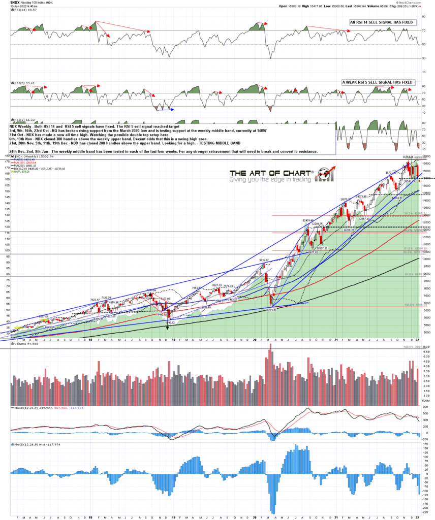
I’ve mentioned a few times on various media that the main support on NDX in this long uptrend has been the weekly middle band, and while that has been tested regularly since the March 2020 low, there has been no significant close below that since that March 2020 low. You can see from my comments on the chart below that I’m noting that any more serious decline on NDX would need to start with a break and conversion of that level to resistance.
On Friday NDX closed significantly below the weekly middle band, and has continued down from there this morning. That is a significant technical break and, if NDX can sustain that break, opens up that larger retracement that I’ve been looking for. At minimum it is a very promising start.
NDX weekly chart:
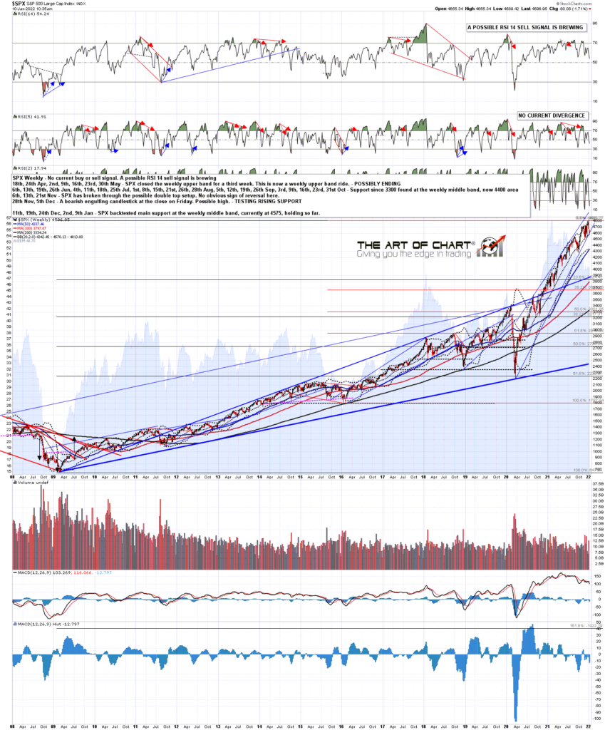
The weekly middle band on SPX is also very important support, and I was saying in my premarket video this morning at theartofchart.net that the next significant support on SPX was there in the 4575-80 area. I was a bit surprised to see that tested today and the LOD today was just above that at 4582. We’ve seen a decent rally from there but ideally we would go a bit lower first and then see a larger rally.
If you’re interested, you can see my premarket video today here.
SPX weekly chart:
Where would the ideal next low be on SPX? Well if you look at the SPX hourly chart below, you can see that there is a possible H&S neckline in the 4500 area. Ideally SPX would go there and then deliver a strong rally into the 4700-50 area, setting up an H&S that on a subsequent break below 4500 would look for the 4175 area. That wouldn’t get SPX all the way back to my backtest target in the 3850-3900 area, but it could get SPX to within credible striking distance of it.
SPX 60min chart:
My next post will be on the shorter term setups but I think my backtest scenario may well deliver in the first quarter this year, particularly after the key support break on NDX that we saw on Friday, so this post is intended as a bigger picture review to refer back to over coming weeks and months.
We did our monthly free public Chart Chat webinar at theartofchart.net yesterday and if you missed that you can see it here or on our January Free Webinars page. We were looking at the prospects for this year across a wide range of markets including equities.
 10th Jan 2022
Pingback: The January Barometer – The Art Of Chart