I have a Shakespeare theme with the title today, which is a quote from Richard III. I am a lifelong Shakespeare lover and have been using some of my quarantine time watching film versions of some of his plays, of which I have about thirty or so in total, many of which were beautifully done. Over the weekend I was watching The Tempest 2011 with Helen Mirren, Macbeth 2015 with Michael Fassbender, and Roman Polanski’s Macbeth from 1971, controversially filmed just two years after the Manson Family tragically murdered Polanski’s wife Sharon Tate and their unborn child.
All good films, though I do struggle with Shakespeare’s great tragedies as I find the main protagonists very unsympathetic. Hamlet is forever looking for excuses not to act, King Lear brings ruin upon himself through his foolish actions at the start of the play but the strangest of all to my eyes is Macbeth.
Why is Macbeth so strange? Well the play starts with the victorious Macbeth being told by the witches that he would soon be the new Thane (Lord) Of Cawdor, which turns out to be true shortly afterwards, and further that he would later become King of Scotland. The mystery for me is that rather than think ‘that’s awesome’ and just wait for that to happen in the normal course of events, Macbeth then murders the King, usurps the throne, and then rules as a tyrant until overthrown and killed not long afterwards by those he injured or mortally offended with his usurpation of the throne and subsequent tyranny. In modern terms one might compare this to him being reliably informed that he would win the lottery, then responding by fixing the lottery, winning it fraudulently, and then being prosecuted and jailed for his crime. Through his impatience he manages to snatch utter defeat from the jaws of otherwise seemingly inevitable victory. Stranger still, most of the many questions posed about Macbeth’s motives in the play don’t seem to involve asking why he’s behaved like such an idiot. Weird.
Before I start I have a couple of things to say, and the first is to apologise for the length of this post. I did think about splitting this into two or three posts but didn’t think that was practical. There is just a lot of information in this post. The second thing is that you may get the impression that I have complete contempt for the Fed and that isn’t right. The Fed is staffed by highly intelligent and qualified people forced by the weight of past errors and poor leadership to take ever more insane measures to try to keep the economic show on the road. They have my sympathy and it is not a job I envy them. In terms of their predicament I described them a few years ago as being on the road to hell, a road that is wide, slopes downwards, and every so often has a signpost that states ‘BECAUSE OF THE ACTIONS THAT YOU HAVE MADE IN THE PAST, YOU HAVE NO CHOICE BUT TO CONTINUE DOWN THIS ROAD’. They are effectively prisoners of circumstance here, with no obvious good options. The title of this post is referring to them, and their position is akin to that of Macbeth after he murders the King of Scotland to usurp his throne. From that point, equivalent here to the Fed allowing the dotcom boom to become a huge bubble, Macbeth’s options steadily narrow to force him down the path to ultimate ruin. Looking at Macbeth I think of the Fed.
On to the markets. I’m mainly taking a long term view today as there’s not much to add to my last post here, other than that the H&S scenario I was looking at there has evolved into a possible double top scenario instead. I will be looking at the short term setup in the last chart on this post.
I’ve been reading a lot in recent days about the many reasons that equity markets will break back up over this level (2900 area), and that, having reached as high as this level on this rally, the benefit of the doubt is now with the bulls as they have already come further than they would have done in a bear market. Nothing could be further from the truth historically, and in this post I’ll be showing you why this rally has come right up to the level one would expect it to reach, and show the historical statistics that strongly favor this rally failing in this area.
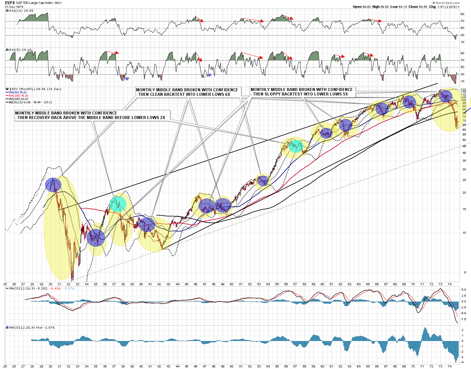
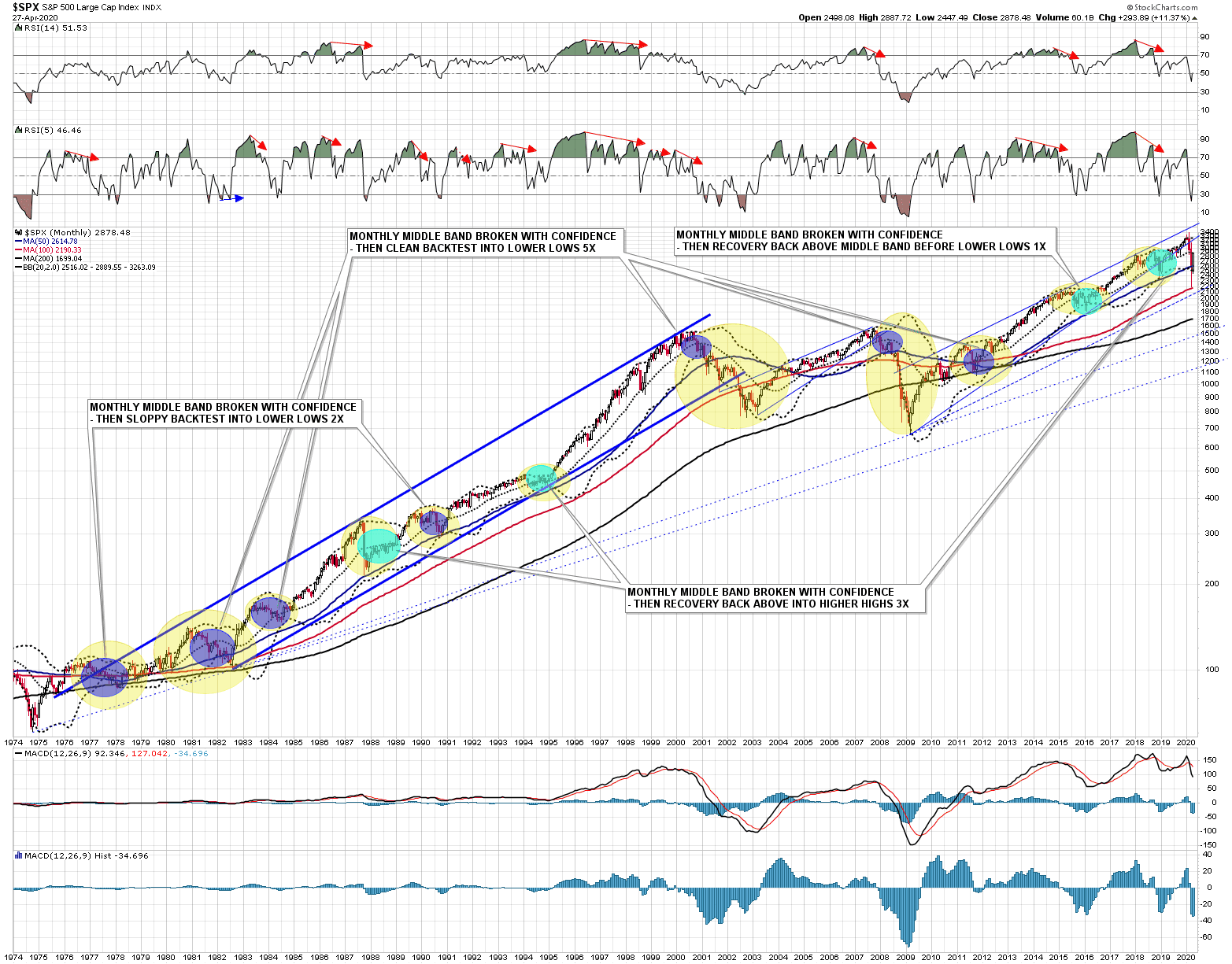
To do this I have prepared two log scale monthly charts on SPX that run back to when data starts in 1929 through to the present day, and have identified 24 occasions in the lifetime of SPX when after a significant bull run, SPX has broken back clearly below the SPX monthly middle band as we have seen it do this year. I would note that there were two borderline candidates, in early 1939 and early 1940 of which I excluded the 1939 example, which if included would have been a recovery back above the middle band before lower lows, raising the number of these from two to three on that chart, and from three to four overall.
The stats over the lifetime of the SPX for what came after the clear break below the monthly middle band were as follows:
- Clean backtest of the monthly middle band before lower lows: – 11 examples.
- Sloppy backtest of the monthly middle band before lower lows: – 7 examples
- Recovery back over the middle band before lower lows: – 3 examples
- Recovery back over the middle band before higher highs (over preceding high) -3 examples
What can we take away from this data? Well the first point is that a backtest of the SPX monthly middle band soon after the clear break below is what you would usually expect to see. That level is at 2889 at the time of writing and the high on SPX so far today was marginally higher at 2921.15. None of those first eighteen clean or sloppy backtests of the monthly middle band delivered an obvious visual close back over the monthly middle band at the end of a monthly candle, so with this month ending at the close on Thursday, the obvious place to see this rally fail would be about here, and the obvious time would be about now. Most of these middle band backtests historically occurred the month after the break down.
So historically you’d expect to see this rally fail about here and about now about 75% of the time, and to result in lower lows before retesting the preceding high about 87.5% of the time. What about the others where the uptrend resumed? Well there were three of course, so about 12.5%, and these were all on the later chart, with the first in 1987, the second in 1994, and the third in 2018/9. Let’s look at these.
The 1987 ‘crash’ is being cited as a parallel for the current market decline and the key thing that I would note about that is that the backtest of the daily middle band came after about four months and then lasted a year, with the first significant break back above it at the end of 1988.
The decline in 1994 was a bit marginal and I wondered briefly whether it should be included, but SPX did trade under the monthly middle band for much of the year, even if the initial break below was marginal. After that initial break it was six months before there was a clear break back above the monthly middle band.
The decline and recovery in 2018 was the fastest, with a hard break below the monthly middle band in December 2018, a recovery slightly back above it in January 2019, and then holding as support at the lows in February, May and June 2019 before the last push up into the all time high at 3393.52 on 19th Feb this year.
So what does this data tell us that we should bear in mind here? The key takeaways for me are these:
- A decline comparable to the one we have seen this year has usually delivered a rally back to the monthly middle band and 75% of those failed there into lower lows.
- Only four of these examples broke back above the monthly middle band within three months of the initial break (about 16.67%) and of those four, three failed into lower lows.
- Of the three of these examples that resumed the uptrend, two spent at least several months testing the monthly middle band before breaking back up and only one managed higher highs within a year of the initial break down.
So what would I also look at in this group? Well the economy has suffered a major shock, so I would pick out those comparable examples at the end of a major asset bubble such as 1929 and 2000, or with a major shock to the system, 1940 (WW2), 1972 (oil crisis), 2007 (financial crisis) as the more obviously comparable examples. Just looking at those five what do I see?
- All five of those delivered backtests of the monthly middle band that failed into lower lows and in all five of those instances the monthly middle band was not broken above on a monthly closing basis until the final low for that move had been made, and was only rarely backtested again on the way to that final low.
- Only one of these examples delivered a break back above the monthly middle band within two years of the initial failed backtest and that was after the low in 2009, with that recovery back over the monthly middle band in Q4 2009, from the failed backtest in Q1 2008.
Though this is a sample of only five previous comparable examples, four of the five delivered fast clean fails at this retest, with only the 1973 backtest being lengthy and involving some intra-month recoveries back over the monthly middle band. All then failed into new lows, with no retest of this area for years afterwards, as even after the 2009 low it was 2012 before the backtest and fail area from 2008 was retested.
Here are those charts for everyone to look at and while some details might be arguable, I don’t think that there’s much overall room for reasonable dispute with my main conclusions, though I will be looking at what obviously is different this time in the next section.
SPX monthly log scale chart 1925-75:
SPX monthly log scale 1974-present:
So what is different this time? Well firstly the Fed is dramatically different this time, and that’s what I’ll be looking at next.
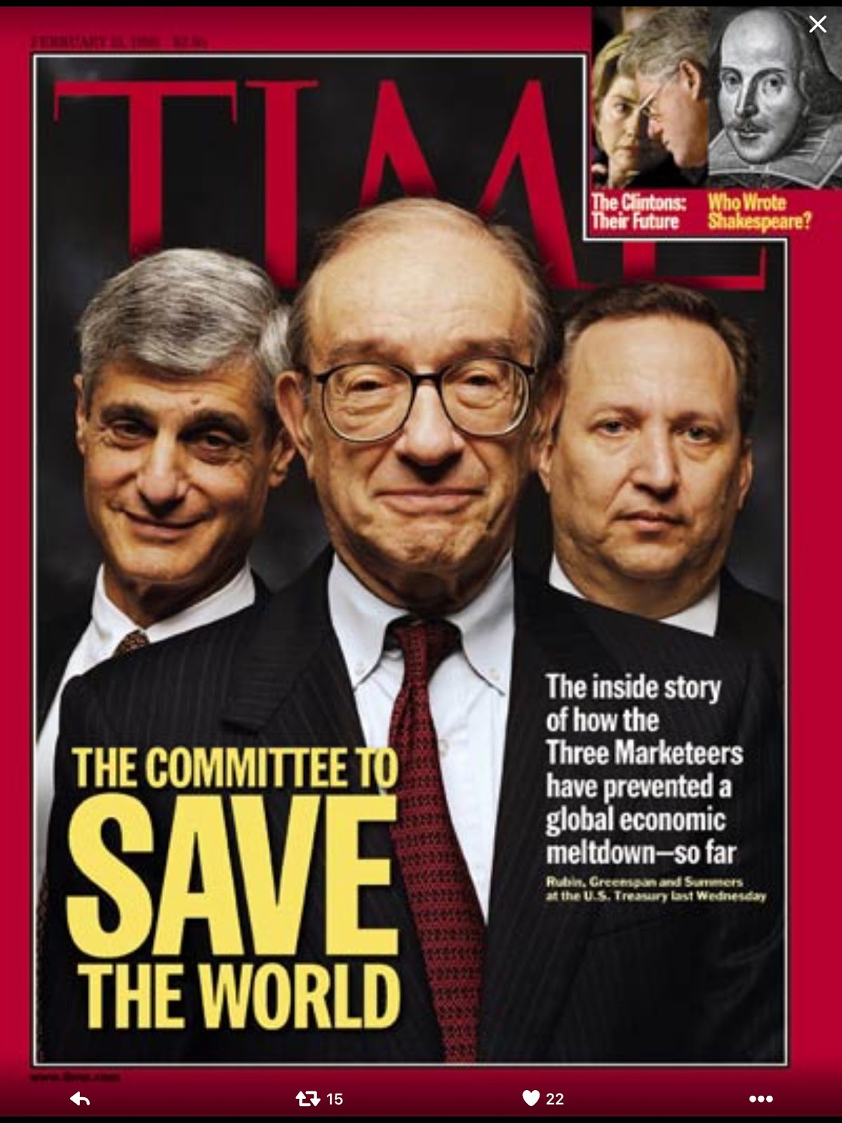
Here is my image choice for my look at the Fed today, and if you’re wondering why I chose it, just read on. If you’re enjoying some of the great demotivational posters that I’ve been using in a lot of my recent posts, and on and off for much of the last decade, check out the author website at despair.com for some good laughs and amusing gift ideas.

Historically the role of the central banker was always pretty clear. Ben Franklin, in another context once said that ‘an ounce of prevention is worth a pound of cure’, and the key role of the central banker historically was to deliver that ounce of prevention. A good central banker tried to smooth the economic cycles, adding some liquidity when growth was sluggish and taking some away when growth started running away. The classic descriptions for me of the job of the central banker by a central banker are from William McChesney Martin (Fed Chair 1951-70) and they described the model central bank aiming to ‘lean against the wind’ or ‘take away the punchbowl just as the party starts to really get going’. The job was about keeping economies on an even keel, managing them through financial panics, and ignoring short-termist politicians, which is why over time central bankers in major economies were made independent of politicians so that they could do their boring but important work with longer time horizons than those allowed by elections.
So what happened to the Fed? Well Greenspan set the ball rolling with a mix of awe-inspiringly bad forecasting skills, arrogant hubris, and a need to be loved, when he let the dotcom bubble happen, as bubbles are fun and party poopers are rarely popular. If you think I’m being harsh about his forecasting skills dig up a transcript of his confirmation hearing from 1987 and his hilarious grilling by Senator Proxmire then, after which Proxmire concluded that he (Proxmire) could at least take some comfort in the thought that Greenspan’s past forecasting record was so bad that it was hard to imagine him doing any worse in the future. In the Dotcom Bubble Greenspan ascribed much of the bubble to improvements in productivity and kept cutting interest rates until shortly before the bubble burst. Those productivity gains turned out to be largely illusory but the bubble’s aftermath was not.
After the dotcom bubble burst, undeterred by previous incompetent failure, Greenspan’s Fed applied a pound of cure to try to fix the aftermath, cutting interest rates hard and letting a property bubble form that then exploded in 2008. By this point Bernanke was Fed Chairman and was initially cautious in response until the failure of Lehman Brothers, at which point it seemed that the entire banking system was at risk of failure. The next pound of cure applied in the wake of that failure has defined the Fed that we have inherited today.
The Fed we have now is unlike any that we have seen historically. Prevention and caution are things of the past, leaning against the wind is a memory and, far from taking away the punchbowl just as the party is getting going, the Fed is forever now adding more punch in the fear that if the party should ever stop, then the aftermath could be so bad that the pound of cure required to fix it might be beyond their power to deliver. The Fed has promised to do whatever it takes to fix this crisis and has already committed many trillions of newly created money to doing so. This is new, and not comparable to anything that any previous central bank has tried to do in any previous crisis. Does this look crazy and desperate by historical standards? Yes. Is there a reason for that? Yes, and that brings me to the second main thing that is very different going into the current crisis. Debt.
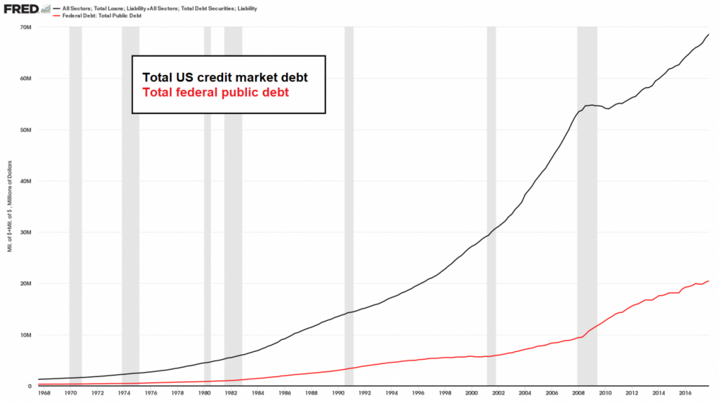
The chart above is a couple of years old and debt is a huge worldwide issue much larger than the issue in the US, but the chart above is a representation of the growth of public and private debt in the US over recent decades. Note that the doveish Greenspan replaced the hawkish Volcker as Fed Chairman early on in 1987, and note the small pause in the increase in private debt during the financial crisis 2008/9. The Fed has been trying to keep the economy on the road for decades now with ever lower interest rates and easier money, and during that time, and in response to these conditions, public and private debt has been growing ever higher to levels that really have no historical precedent.
Historically increasing levels of debt tend to depress growth and increase inequality, and obviously we’ve been seeing that deliver in recent decades, and of course there is also an obligation for that debt to be serviced and, in theory ultimately, to be repaid. What happens in the event that a highly leveraged economy receives an economic shock that makes it hard to service that debt? Well the expectation would be that a significant amount of that debt could not be serviced or repaid, and worst case much of that debt might default. Given the huge level of this debt and the way it is layered through the economy and the financial system, that could precipitate an economic crisis on a scale that might risk a second Great Depression which is an outcome that, more than anything else, it is the Fed’s highest economic priority to prevent.
Overall the Fed has been lurching from crisis to crisis for decades now, their original brief as economic watchdog is long forgotten and their time seems mainly to be split between adding floors to a skyscraper of debt in the world economy, and trying to catch the chunks of debris falling from that unstable edifice that gets ever less stable the higher it climbs. The Fed looks ready to take any measures, however deranged, to try to prop everything up into an approximation of economic health in the hope that if they can do so for long enough, something will turn up that makes everything turn out ok. Who knows? That might even happen.
Right here and now though what’s the bottom line? Historically the odds of a failure here on SPX into lower lows are very high, and the chances that whatever happens here will deliver new bear market lows before a retest of the all time high on SPX are close to 90%. Short term that failure would usually happen about here, and about now.
Against that weight of historical precedent stands the Fed, in a stance and wielding historical weapons that are without historical precedent, and ready to act in a way that most past Fed chairmen, possibly including even Alan Greenspan, would view as wildly reckless. Can they prop up the markets a bit longer? Maybe. We’ll have to see.
Regardless though, a direct resumption of the uptrend coming into 2020 looks both hard to deliver and unlikely to last long, but if SPX should close April much over 2900 on Thursday, that would open a possible higher range 2900-3100 over coming months until the next leg down would then most likely start anyway in the summer. We will see how this develops, and of course nothing is ever certain until it has happened.
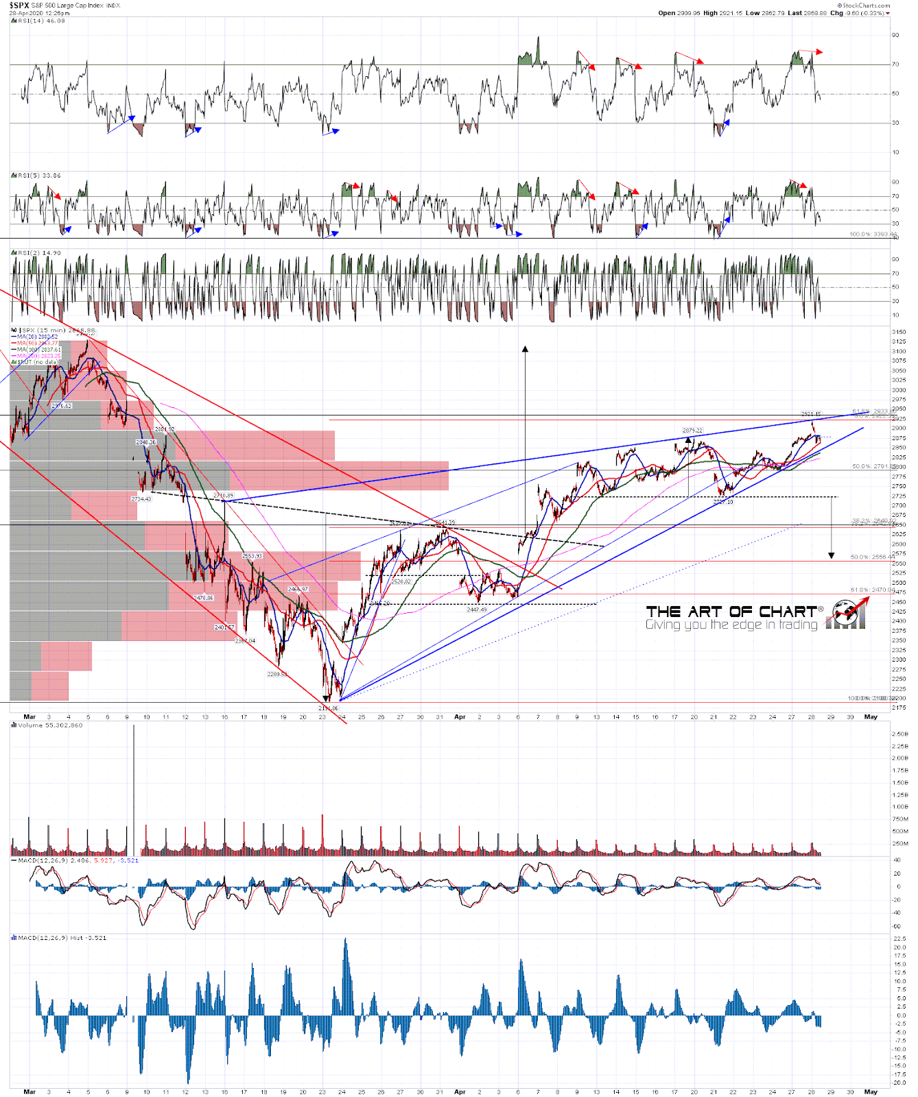
Back to the short term, where the SPX high this morning has finally established a really good resistance trendline, and this is now a very good candidate for the rally rising wedge. Ideally SPX would next retest or modestly break rising wedge support, currently in the 2840-5 area, then retest the rally highs tomorrow into FOMC and make a marginal higher high that respected the 61.8% retracement area 2930-5, then fail to start the next leg down for this bear market. I’d also like to see rally high retests on NQ and ESTX50 to complete an ideal overall topping setup.
SPX 15min chart:
I don’t know yet whether Stan and I will be doing our free monthly Chart Chat at theartofchart.net this coming Sunday or the following one. Whenever we are doing that, we’ll be reviewing progress on SPX and the usual wide range of indices, bonds, currencies metals, energies and other commodities. I’ll be tweeting out more details on my twitter as I get them. I’m hoping to get another (much shorter) post out this week on Thursday or Friday looking at the action on SPX between now and then.
UPDATE: The next free public Chart Chat at theartofchart.net is on Sunday 3rd May and you can register for that on our May Free Webinars page here.
 28th Apr 2020