
SPX broke up through both of the inflection points that I was looking at in my post earlier this week with the second one at the island top gap into 3337.75 yesterday. SPX here is very stretched, but that doesn’t mean that it can’t go higher, and there are no longer any significant resistance levels between here and a retest of the all time high, which I’m now leaning towards seeing before SPX makes the next serious retracement.
A serious retracement is of course a retracement strong enough to break and convert the daily middle band and then likely deliver a reversion to the mean move or more. I was asked earlier this week what I meant by that and I’m going to take a little time today to explain what I mean as it is very simple and extremely easy to incorporate into your market views if you don’t have a system to do this already.
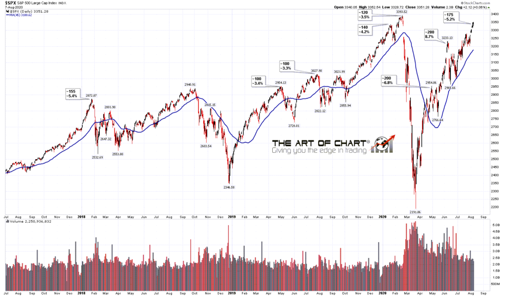
The system I use is based on the distance that price on SPX is from the 45dma, and I’ve found that this gives a good view. If you were to use the 50dma instead that would likely be just as effective but I’ve always used the 45dma myself. On the two charts below I’ve looked at the highs over the last seven years on SPX that delivered a mean reversion move, here defined as a retracement to the 45dma or lower. Obviously the 45dma is a moving target and I have marked some of the interim highs on the way to those highs that didn’t deliver a mean reversion move to show that the markets could be less stretched by the time that mean reversion high delivered. As SPX has risen considerably over this seven year period I have listed both the approximate number of handles above and the percentage above for each high.
SPX daily vs 45dma 2013.5 to 2017.5:

The chart that interests us most here of course is the chart including the current move and at the close today I had SPX about 175 handles over the 45dma which is about 5.2% above. That is stretched by historical standards though the two highs since the March low have both been more stretched, at 6.8% for the April high (no mean reversion completed), and 8.7% for the June high (almost exact mean reversion move). That isn’t untypical after a big decline and there was an interim high at 6.1% over the 45dma just after the early 2016 low.
I haven’t marked in some of the smaller highs over the seven years but all of the highs I marked in before March 2020 landed in a range between 2% over the 45dma to 5% with the exception of the late 2015 high at 5.7% and the early 2018 high at 5.4%. I also noted that early 2016 interim high that didn’t deliver a mean reversion move at 6.1% above that went into a mean reversion high at 4%.
The point is that from a mean reversion perspective the air is getting pretty thin up here, though after the resistance breaks this week I’m not seeing any strong signs that the next mean reversion high will be below the retest of the all time high. Let’s look at that next.
SPX daily vs 45dma 2017.5 to DATE:
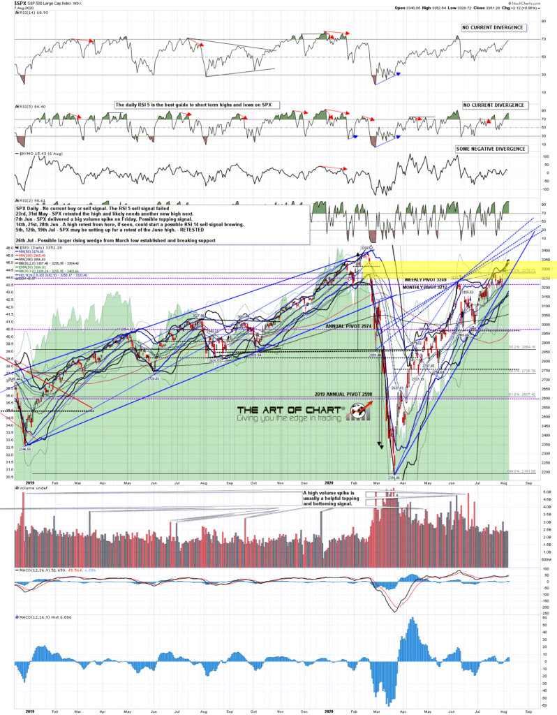
On the 15min chart I have a decent short term resistance trendline currently in the 3365 area, though that would be unlikely to deliver the mean reversion high. I would note the beautiful triangle on the 15min RSI 14 that broke down today and may well deliver a more modest retracement early next week.
SPX 15min chart:

On the hourly chart there is no current negative divergence and while the current move might still be an overthrow of the resistance trendline now in the 3300 area, my eye is drawn to the possible alternate wedge resistance trendline currently in the 3405 area.
SPX 60min chart:
![]()
There’s no current divergence on the daily chart either so I’d be looking for a retracement and then high retest before a likely swing high. Given the lack of either distance or resistance between here and the mean reversion high, I’d expect that retest before we see that high, but that the next mean reversion high would likely not be far above it.
SPX daily chart:
Stan and I are doing our monthly free Chart Chat at theartofchart.net on Sunday 9th August at 4pm and if you’d like to attend then you can register for that on our August Free Webinars page. We’ll be looking at the likely impact of COVID-19 on economies and markets over the coming months and years as well as the usual market analyses. Everyone have a great weekend.
 07th Aug 2020